Lost Souls Capsule - Design Narrative
Ghost In The Shell

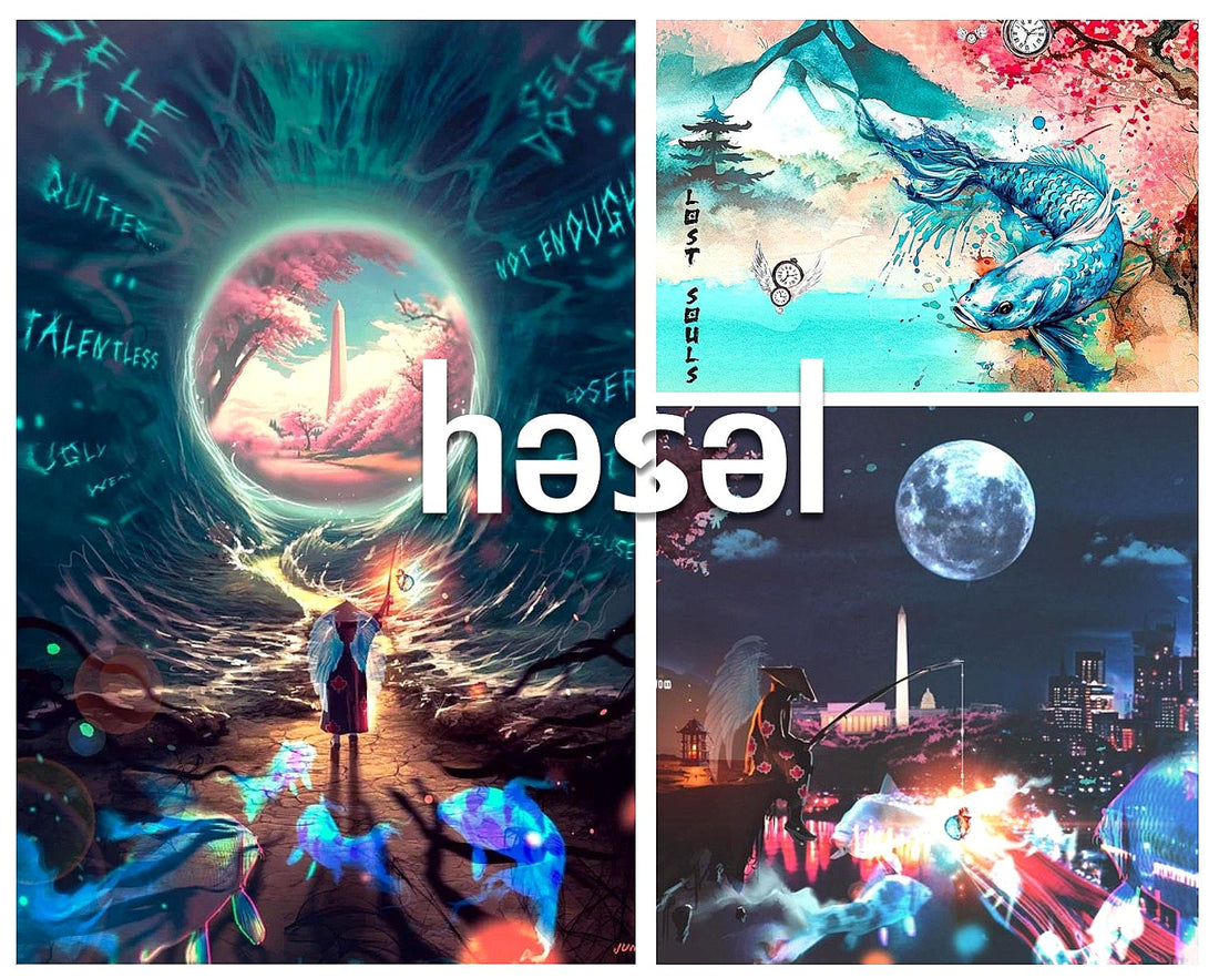
"Ghost In The Shell" merges three cities — Los Angeles, Washington D.C., and New York — into a single 'innerverse', symbolizing the environments that mold and often confine personal identity. Through the image of a ghostly koi fish suspended between worlds, the piece explores the theme of lost souls trapped by societal expectations. The koi — a traditional symbol of perseverance and transformation into a dragon — serves as a personal reminder to the author of a 'dragon' close to him, someone who helped save this brand from fading before it ever had the chance to live.
At the edge of this universe stands a faceless guardian angel, casting a line baited with a glowing symbol — half brain, half heart — representing the balance of inner peace, self-love, and the acceptance of one’s true self. Inspired by memories of fishing with the author's late father, the guardian figure embodies guidance, hope, and unseen protection. Cherry blossoms, blooming quietly in the scene, hint at renewal after hardship, while the Washington Monument, positioned centrally, speaks to rebirth and resilience.
Visually influenced by anime aesthetics, the guardian angel draws from the spirit of protagonists who stay true to themselves despite adversity. Through this faceless guide, the artwork invites viewers to project their own memories, struggles, and guardians, making the journey toward self-acceptance a shared and universal experience.
Eye Matter

Eye Matter" picks up where "Ghost In The Shell" leaves off, offering a new chapter of the journey toward self-acceptance. Inspired by the story of Moses, the faceless guardian angel steps forward — not leading an exodus across a desert, but guiding lost souls back from the prison of their own minds into the light of reality. Yet, just like the Pharaoh chased Moses and his people, the darkness follows close behind, desperate to pull them back.
In this vision, the guardian parts not a sea of water, but a sea of demons and whispers — the doubts, fears, and voices that cling to us when we try to break free. The sea itself forms the iris of an eye, forcing us to confront the distorted perspectives that try to cloud our view of who we really are.
Hidden within the artwork lies a deeper truth: 'Eye Matter' sounds like 'I matter' — a quiet but powerful reminder that we are enough as we are. That even when the voices scream otherwise, we must hold fast to faith — because He has a plan for us, even when we can't yet see it.
Day Ones

"Day Ones" is a tribute to the real ones — the unsung heroes who stood by before the vision was clear, before the clout, before the noise. In a time when approval is currency and truth gets buried beneath trends, this piece honors the foundation: the ones who remind us who we are when the world tries to make us forget.
Rendered in a soft, watercolor style, the design blends koi fish, cherry blossoms, and now, a quiet mountain in the distance — a nod to Part 4 of the həsəl story: 'We don’t climb mountains to reach the top. We climb to see who we become along the way.' The mountain doesn’t just symbolize the journey, but the quiet strength it takes to walk it.
The title also carries a deeper layer. "One’s" is drawn from a personal motif: the 11:11s the author kept seeing — a quiet affirmation from the universe. A reminder that he wasn’t alone. That he was blessed with four ‘Ones’ who helped him not just survive, but live again.
This tee is a wearable thank-you to the ones who have always been there from the start.
The Logo

The "Logo Tee" is more than just a mark — it’s a symbol of both beginnings and endings. On the black tee, the həsəl logo stands alone at the center, a small light surrounded by darkness — a light that can’t be snuffed out, no matter how heavy the darkness feels.
Look closer, and you’ll find a deliberate gap in the "S," forming two mirrored "C"s — representing Change and Commitment. These two C’s are what shape the "S" in the logo itself. Change, not into someone new, but into someone real. Commitment, to holding onto that peace and the pursuit of happiness defined on our own terms. This foundation builds the path toward your version of Success.
On the white tee, the logo appears in black — a reminder that darkness never truly disappears, but when we choose happiness, it shrinks. It weakens in the presence of peace, purpose, and the joy we commit ourselves to chasing.
At the heart of it all, the "S" carries a deeper meaning for the author — a personal belief that as long as he keeps life Christ-Centered, he can overcome any darkness.
Simple at first glance. Heavy in spirit. The "Logo Tee" is a wearable reminder: the light will always be there.